Translation

Showing posts with label Photoshop. Show all posts

31.10.10

Icy Image Effect

Step 1

Start out with a photograph to which you wish to give an icy look. I've used a scenery. It has a different effect on different images.
Step 2
Duplicate your layer. (With the current layer selected drag it to the fifth icon below the Layers panel) Now you'll see two layers on the layers panel. Now continue all the steps with the topmost layer selected.
Step 3

Click on Image>Rotate Canvas>90 CW. Next click on Filter>Stylize>Wind. This opens up the Wind window. On the right is a snapshot of the widow.


Step 4
Give the settings as in the snapshot on the right and click OK.
Step 5
Now rotate image back to normal, click on Image>Rotate Canvas>90 CCW.
Step 6
Click on Image>Adjustments>Hue/saturation. The Hue saturation window will open. I've used these values, but I suggest you to experiment since the effect differs for different images. Hue - 210, Saturation - 29, Lightness - +23

Step 7
Next click on Filter>Artistic>Plastic Wrap. The Plastic Wrap window appears as in the image below right, experiment these settings and click OK.


Here's the final result.


Shiny Starburst Effect photoshop

pen your canvas. Press D. (to set default foreground and background colors) Press Alt+Backspace to fill canvas with black color. Duplicate the layer ( right click on the current layer on the layer's panel and select 'duplicate layer '). Continue working on this new layer.

Step 2
Select the gradient tool from the tool bar, place the cursor at the bottom of the canvas, click and drag it to the top of the canvas. Now your canvas has a black and white gradient fill.
Step 3
Click on Filter>Distort>Wave the Wave window appears, give the settings as in the image on the right.
Step 4
Click on Filter>Distort>Polar Coordinates. The polar coordinates window opens up, give the settings as 100% and check the 'Rectangular to Polar' option.
Step 5
Click on Image>Adjustments>Hue/ Saturation and change the settings to : Hue - 200, Saturation - 25 and Lightness - 0. Check the Colorize option

Step 6
Next click on Filter>Render>Lighting Effects and set the Light type to Omni let the other settings be default.
Here's the shiny star!


30.10.10

Create Simple Cartoon Characters in Photoshop

Simple Character

Step 1

We’ll create this at 300dpi so set up a canvas that’s 750×750 pixels at 300dpi. It’s also better to work in RGB as you get more control over the colour output and more options within Photoshop itself. With your canvas open, select the Pen Tool and set it to Shape Layers in the Options bar (Window > Options if it’s not visible). Use this tool to draw in your basic character shape, at this stage don’t worry about colour.
Simple Character

Step 2

Once you’ve drawn a basic shape it’s time to add colour so select your Body Shape Layer and go to Layer > Layer Styles > Gradient Overlay. Set up a 2-colour gradient inputting 4c7812 and aed82c in the field marked ‘#’ in the Color Picker window. Your gradient should look similar to the screen grabs.
Simple Character
Simple Character

Step 3

Select the Ellipse Tool and make sure it’s set to Shape Layers (Use the Options bar to do this). Select White as your foreground colour and draw an ellipse as your eyeball. Draw a smaller black circle for a pupil (hold the SHIFT key whilst you draw – this will constrain a perfect aspect ratio). Then use the Pen Tool to draw a small white triangle over the pupil. If you need to change the colour of any of your shape layers then simply double-click the corresponding colour icon on the Layers palette. Finally, select the EYEBALL layer and go to Layer > Layer Styles > Inner Shadow and set up as in the screen grab.
Simple Character
Simple Character
Simple Character

Step 4

Select all of your eye layers in the Layers Palette and click the Folder icon at the bottom of the palette to group them. Name the Group LEFT_EYE. Then select the Move Tool from the Tools palette, hold down the ALT key and drag the group across the canvas to create a duplicate. Name the duplicate group RIGHT_EYE. The eyes don’t quite fit the perspective of the body so with the RIGHT_EYE group selected go to Edit > Free Transform and resize and rotate to 94.5% size and 6.0 degrees.
Simple Character
Simple Character

Step 5

The mouth is easy enough. Select the Pen Tool and set it to Shape Layers. Click one point and then hold the SHIFT key and draw a point to the right of the first one. Holding SHIFT will force the point to be drawn within increments of 45degrees from the last point drawn. In this case we want a horizontal line. Then pick somewhere between the two points but lower down and click and drag to create a curve. Then click the original point (the open end) to close the path. You can edit any of these points by using the Direct Selection Tool (the white arrow not the black) and dragging the points or their handles. You can also resize by using the Free Transform Tool. Draw in two teeth over the mouth.
Simple Character
Simple Character

Step 6

Select the Paintbrush Tool and edit the options to create a 16 Pixel brush with 100% Hardness. Set the foreground colour to 213600. Select the Pen Tool and set it to Paths. Create two new layers (Layer > New Layer) and call one LEFT_ARM and one RIGHT_ARM. Make sure that LEFT_ARM is positioned above BODY in the Layers palette. RIGHT_ARM should be below BODY. Draw a left arm with the Pen Tool, select LEFT_ARM layer and open the Paths palette. Click the little arrow at the top right of the palette to bring down the drop down menu. Select Stroke Path. Repeat the process for the RIGHT_ARM layer.
Simple Character
Simple Character

Step 7

Repeat the process to draw in some legs. Bear in mind that the legs should be thicker so I opted for a 26 pixel brush to Stroke Path with. Booger Man should be taking shape by now.
Simple Character

Step 8

The hands are a little trickier. Select the Pen Tool and set it to Shape Layers. Draw a curve point (click and drag downwards until the handles appear) at the base of the wrist. Then draw another curve point opposite, dragging the handles roughly the same distance. Draw a curve point where the thumb would meet the fingers of a clenched fist. Then press and hold the ALT key, click the point again and drag a new handle as shown in the screen grab. Holding ALT and clicking a point splits it’s handles so you can move them independently of each other. You’ll need to use this technique again at the base of the thumb. Use the Direct selection Tool to manipulate the points, their handles and generally clean it up. Duplicate the hand and call the duplicate RIGHT_HAND. Use Free Transform to rotate and resize until they are in perspective.
Simple Character

Step 9

Use the Pen Tool to draw in a shoe. Set Black as your foreground colour and draw as in the screen grab. Use the Direct Selection Tool to clean up and perfect your shoe. Once done, duplicate, rename, rotate and resize so it fits your perspective.
Simple Character

Step 10

Lets add another layer of depth by adding more shading to the body. Select BODY layer and go to Layer > Layer Styles > Inner Shadow. Firstly, deselect Use Global Light and then set up as in the screen grab. I used colour #527e14 for the shadow. I had to move the left arm a bit to accommodate the new shadow.
Simple Character
Simple Character

Step 11

Add as much depth as you like. I’ve drawn in some shine on the shoes and a Tongue using the Pen Tool. I’ve also drawn in some spots using the Ellipse tool before resizing and rotating them with the Free Transform tool. Once your character is complete you can move all the elements around to fine tune your character. You can also resize and rotate things until you are happy.
Simple Character


28.10.10

Design a Trendy Cafe Layout in Photoshop

1. Create a new document that’s 900×1050 pixels. Plan out where everything will be on the website.

2. Get the rectangle tool and draw backgrounds for the menu and header using the colors below. On the header go into Blending Options and select Overlay Gradient and choose the colors below.

3. Write out the menu names using the font Nilland from here.

4. On top of the menu names place some cafe icons, you can download these icons here.

5. Next get some torn paper like below, you can get this from here. I’ve erased the background of the paper.

6. Next place the paper like below. I’ve erased the torn top of the paper using Polygonal Lasso Tool.

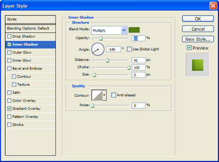
7. Go into lending Options on the paper layer and add in this Drop Shadow effect:

8. Type in the Cafe Name like below, I’ve used the font Pristina which you can here for the title and Nilland font.

9. Next go into Google and search cat silhouette for a logo example. I’ve used this picture.

10. Next grab the Custom Shape Tool and choose the shape I have selected below. Draw the shape over the banner using the color white.

11. Rasterize the Shape layer, pres ctrl + click on the banner box to highlight the header.

12. When the header is selected go to the previous shape layer, copy& paste it onto a new layer. Remove the other shape layer, set the new shape layer opacity to 13%.

13. With the Rounded rectangle tool create a shape for the subscribe buttons. Use the Blending Options below. Get the coffee cup subscribe buttons from here.

14. Place the subscribe section in the sidebar area. Using the Ellipse Tool draw some circles like the ones below.

15. Next put some ‘Weekly Specials’ on the sidebar like below. I’ve used food images from here.

16. Next fill up the content area. I’ve placed a box on the left hand side for the icons and put a wooden background behind the cafe icons and a black stroke. Then just add the title and summary text.

17. Below them put in a testimonial box, I’ve placed a round rectangle shape (using the same color as the menu bar), with the pen I’ve put a shape on the bottom so it looks like a comment box. Next place 2 large quotation marks on the box, then using smaller get put in the testimonial.

18. Lastly put in a footer.
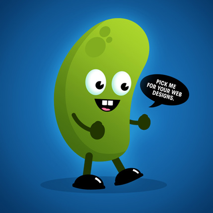
Final Result


Forming Symmetrical Shapes photoshop

First make the ruler visible. To get a ruler hit Apple + R (CTRL + R on Windows). The ruler menus will appear at the top and left of the screen. Move the mouse over the left ruler and then click and drag to place a ruler on the canvas. Then, with the pen tool draw the shape.


Select the path (use the selection tool or V). Then, pick the Reflect tool (O). A small blue target icon will appear. This is the point at which the reflection will occur. To get the reflection on the line, click once on the blue line and the target will move. You should end up with something looking like this:


To make the reflection click hold and drag to the upper left of your path. Hold down SHIFT while dragging to constrain the rotation and ALT to copy the shape. If the shape moves to the other side you have forgotten to hold ALT which will copy the shape creating a mirror.


Currently we have two separate paths. We need to join and average the paths together. Averaging means that the two end points will be averaged before they are joined. There is a handy shortcut to join and average at the same time. To do this, choose the Direct Selection Tool. Select (A) the end point of your shape. The end point appears as a small blue rectangle. Hold shift and pick the end point on the mirrored shape.

Now hit Apple + SHIFT + ALT + J (Ctrl + Shift + Alt + J on Windows) to average and join the paths. If you get an error message saying "To join you must select two endpoints...” this means that you have chosen other anchor points rather than just the end points. Check there are no other anchor points with blue squares rather than white squares (blue means they are selected and will cause the error.)


If you have done everything you now have a complete, joined path which you can fill, use as a symbol or pattern swatch.