Final Image Preview
Below is the final design we will be working towards. Want access to the full Vector Source files and downloadable copies of every tutorial, including this one? Join
VECTORTUTS PLUS for just $9/month.
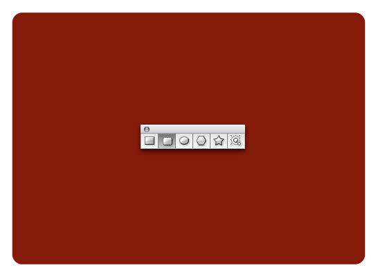
Step 1
Use the Rounded Rectangle Tool to draw the basic notebook shape. Press the Up and Down Arrow keys while you draw the shape to change the corner radius.
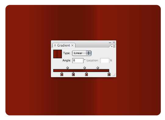
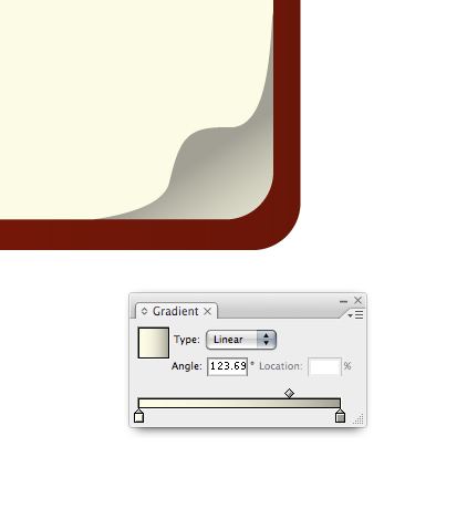
Step 2
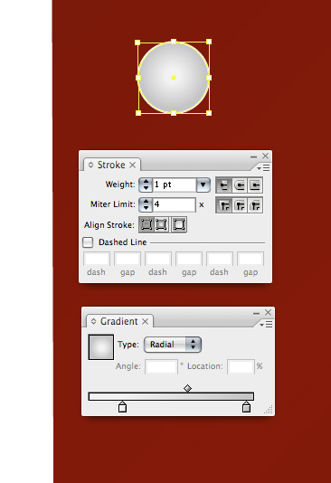
Apply a complex gradient.
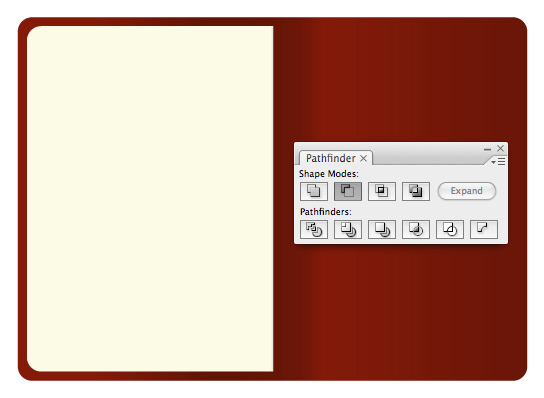
Step 3
Duplicate the notebook and trim it in half using the Pathfinder.
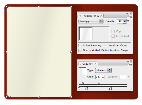
Step 4
Duplicate the left page and place it on top of itself. Apply a subtle gradient and set the Transparency to Multiply. You can quickly change the darkness of the shading by adjusting the Opacity.
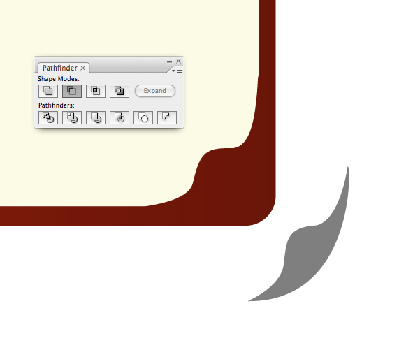
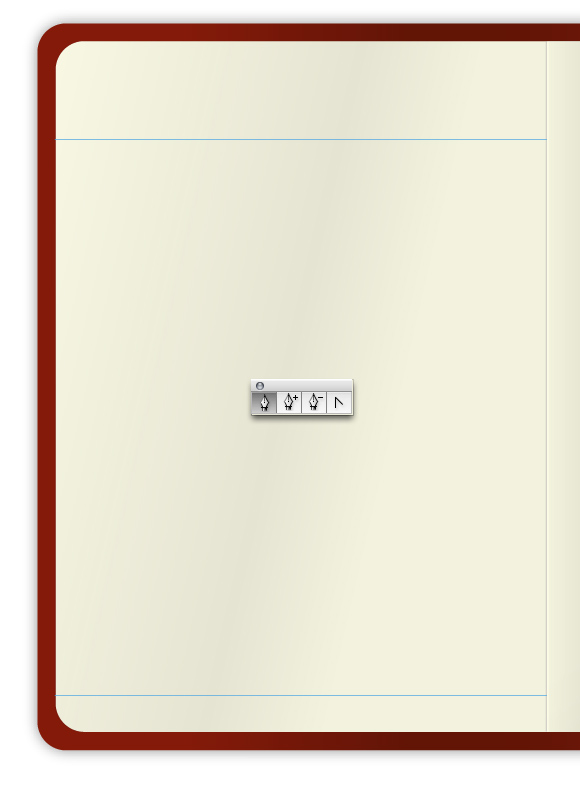
Step 5
Using the Pen Tool (P) to draw a page curl shape. Using the Pathfinder subtract the page curl shape from the edge of the paper.
Step 6
Give the paper underneath the page curl a darker gradient to simulate that it is in shadow.
Step 7
Draw a half-circle and condense it slightly. Place the half-circle under the page curl to complete the effect. Note that the gradient has a slightly lighter edge on the right. This is called reflective light and is an important detail in the overall realism of the page curl.
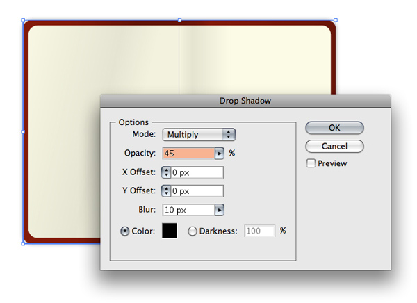
Step 8
Apply a drop shadow to the notebook. Be advised, you may want to apply all of your drop shadows as the last step, depending upon how fast your computer is. Drop shadows decrease Illustrator’s speed performance. But, if your computer is fast enough this may not be a problem.
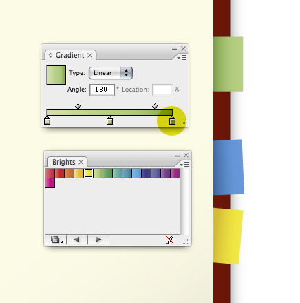
Step 9
Create some colorful tabs by drawing a rectangle and then using the preset gradients to color them in. To access them go to Window > Swatch Libraries > Gradients > Brights. You may want to make the highlighted color slightly darker as our design calls for the tab to appear as if it’s wedged in between the pages.
Step 10
Create the ruled lines by first drawing two horizontal lines.
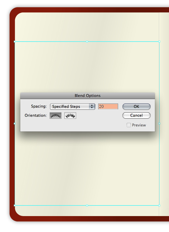
Step 11
Select both lines then go to Object > Blend > Blend Options. Select Specified Steps, enter a value then press OK. Go to Object > Blend > Make.
Step 12
This is the result. You can adjust the number of lines by going to Object > Blend > Blend Options.
Step 13
As is, the lines overlap the page curl. To fix this, expand the blended lines by going to Object > Expand.
Step 14
Ungroup the lines you just expanded and adjust their horizontal length.
You cannot give strokes a gradient, so, using the Rectangle Tool (M) draw a very thin rectangle and give it a slightly darker blue gradient. Draw a small curved line and give it a darker blue color too.
Step 15
Place your new elements on the page curl section.
Step 16
This is what your design should look like right now.
Step 17
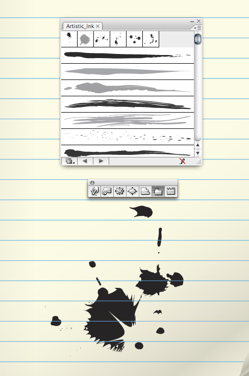
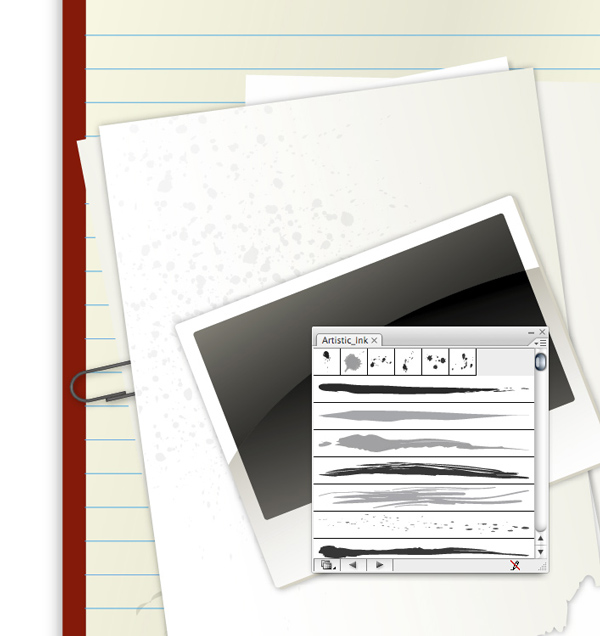
Easily make random stains on the paper by using the Artistic Ink panel. Go to Brush Libraries > Artistic > Artistic Ink. You can drag the swatches right onto the page or you can draw a line using the Pen Tool and apply the swatch to the line. To further edit the ink swatches you’ll need to expand the ink first.
If you’re familiar with Illustrator you may be able to recognize when someone is using built-in ink swatches. To remedy this simple alter the ink swatches by using the Crystallize Tool (found under the Warp Tool, Shift + R.) Or, try using a variety of warping tools to achieve some interesting results.
Step 18
Give your stains some gradients, set their Transparency to Multiply and adjust their Opacity to help them blend with the paper.
Step 19
Create the holes in the paper by drawing an ellipse using the Ellipse Tool (L.)
Step 20
Align your holes perfectly by using the Align Palette.
Step 21
Construct the pencil using basic shapes. Note, the triangle used for the tip of the pencil was created using the Star Tool. To vary the number of points the star has simply use the Up and Down Arrow keys while you’re drawing the star shape.
Step 22
Give the area shown below a jagged edge by using the Warp Tool.
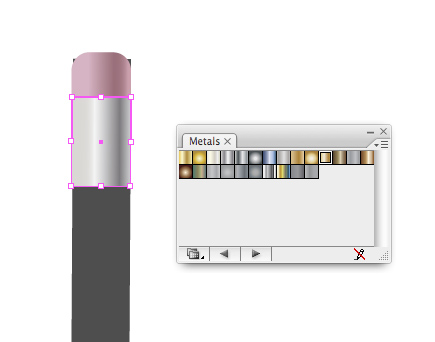
Step 23
Use Illustrator’s built-in Metals gradients by going to Window > Swatch Libraries > Metals.
Step 24
The barrel of the pencil can be quickly created using a gradient to the fullest extent. To give the impression of a number of faces on the pencil apply a gradient with four colors, all slightly different but in the same family. Next, slide the yellow highlighted areas below so they’re as close to the green highlighted areas.
Step 25
Give the tip of the pencil gradients. Give the exposed wood section of the pencil an Inner Glow by going to Effect > Stylize > Inner Glow…
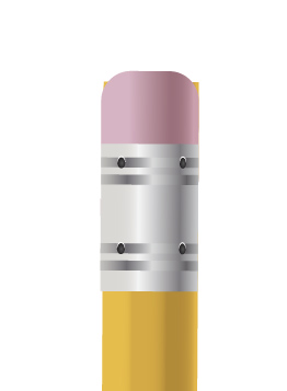
Step 26
Duplicate the metal part that holds the eraser on, condense it and alter the gradient to give the illusion of ridges on top of the metal base.
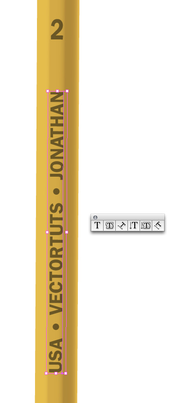
Step 27
Using the Type Tool (T) apply some text to your liking. The font I’ve used is ITC Franklin. This completes the pencil.
Step 28
To create the stand-alone pink eraser, draw a rectangle and give it a tenuous gradient. Take a notch out of the edge of the eraser by drawing a random shape and subtracting it from the rectangle using the Pathfinder.
Step 29
Create eraser shavings by using the Pencil Tool (N.) How convenient! Arbitrarily draw some shapes and apply a pink to grey-pink gradient. Note, the easiest way to close an open shape is to hold down the Option key when you are ready to close the shape.
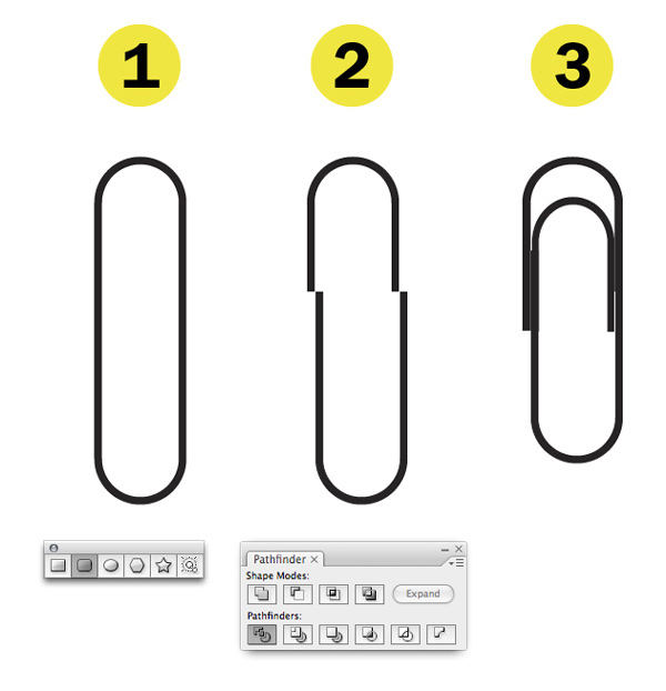
Step 30
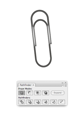
Create the paper clip by:
- Draw a rounded corner rectangle. Press the Up and Down Arrow keys to adjust the curvature of the rectangle. As you can see, the final shape is not a rectangle at all. When you have an in-depth understanding of Illustrator’s Tools you’ll be able to quickly create almost any shape.
- Use the Divide option to slice the paper clip.
- Reposition and expand and condense the sections of the paper clip to look as they do below.
Step 31
Merge everything using the Add to Shape Area in the Pathfinder. Apply a dark Inner Glow by going to Effect > Stylize > Inner Glow to complete the paper clip.
Step 32
Position all your elements on the page to your liking and add drop shadows. You may want to duplicate all of the objects, merge the individual shapes that comprise each object using the Pathfinder and apply the drop shadow to that shape. This way, the drop shadow won’t be applied to all the little elements that make up each group of the illustration, such as the pencil.
I find it more pleasing to create a group of objects instead of spacing everything apart. However, this is up to you.
Step 33
Using the Rectangle Tool to draw a rectangle and give it a subtle drop shadow and gradient.
Step 34
Give the edge of the paper a torn look by drawing an arbitrary shape with the Pencil Tool and using the Pathfinder to subtract the shape from the paper.
Step 35
Creating the photo is a cinch. Draw a couple rounded corner rectangles. Vertically align them using the Align Palette.
Step 36
Draw an ellipse that falls where you’d like the reflection to be placed. Use the Divide option in the Pathfinder to break all your shapes up.
Step 37
Now you’re able to give each section of the photo uniform gradients.
Step 38
Give the white paper a bit of texture by using a different ink swatch from the Artistic Ink Palette. Vary your selection so all of you ink is unique.
Step 39
Create the holes in the folder by first drawing an ellipse and giving it a white Stroke.
Step 40
Create the shadow and highlight by blurring simple shapes. Create the arc shapes over the holes by layering two ellipses on top of each other and using the Subtract from Shape Area in the Pathfinder. Create the large angled reflection by blurring a rectangle and adjusting it’s Opacity.
Step 41
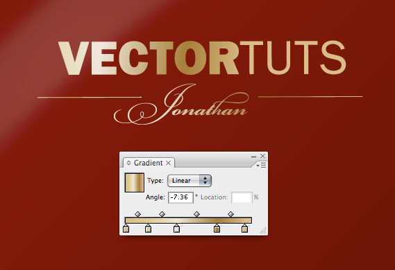
Add some text to the front of the folder. I’ve used ITC Franklin for "Vectortuts" and Bickham Script for "Jonathan." Apply a gradient from the built-in Metals selection.
Final Image
Here is the final design. You’ve just learned how to create a vector collegiate notebook design. It’s also the perfect base for creating a cool website header theme!
 12:36:00 PM
 tutorial_mania


 Posted in
Adobe Illustrator
Posted in
Adobe Illustrator


0 comments:
Post a Comment